The purpose of this set of posts is for you to gather tips and insights on how to create a successful digital product. We consider that the main topics are: validating the product, understanding the user, acquiring new users (using SEO and growth hacking strategies), and improving the user experience , (UX) and functionality with a data driven approach. Throughout the posts, we’ll be explaining these key concepts you certainly need to cover in order to succeed. We’ll be using as an example a project we had, called Agrotrabajo, so it’s easier for you to understand the concepts. This is a summed up recipe about a long process, we're sure it’s useful for your project!
You Must Know Your Users
Knowing your final users isn't about knowing their age, gender and socioeconomic level. Knowing your user is really understanding who will be on the other side of the device and how he will interact with your product. Identifying a target audience is difficult, but the real challenge is processing and understanding all that information to make the most of it when it's time to define the specifics of the product.
We'll be making reference to a product we developed called Agrotrabajo, so in case you haven't read How to Create a Successful Digital Product Part 0: Validating the Product, go ahead and read it now to understand the product and get some fundamental tips on the validation stage.
The Challenge: Our Users
The biggest challenge was about who our users were. We assumed that people working in the Uruguayan countryside were not good with technology and even at reading text. We made an investigation in our users and it turned out our hunch was right: 53% of agricultural workers have finished only primary school and 14% didn’t even go to school. This meant that 66% of our users probably have a hard time reading and writing.
Therefore, our platform had to be truly intuitive and basic for them to understand and correctly interact with it.
As we had a working minimum viable product (MVP), we were able to gather much more information on our users. We integrated the MVP with Google Analytics and discovered that only 9.5% of workers access through computer, so most of them (90%) would access the platform using their phones. Also, 90% of them have Android phones. The most used phones were Samsung, usually old and cheap models with small screens. Moreover, the internet connection in the countryside isn't optimal.
We had all this information but we needed more. Why? Because it didn't matter how much information we had on these people, we couldn't empathize with them. We, tech nerds working from a huge tech park in the city, couldn't genuinely understand how they, people working with agriculture in the middle of the fields, thought/felt/relate with tech/communicate/etc. Knowing the information just wasn't enough, so we used a strategy we love to use when it comes to understanding our users...
We created a user persona and called him José. A user persona is an imaginary character created to represent the different types of users that could use a website. User personas aren't just demographic data: they are humanized characters (with their history, family, friends, studies, personality, etc) so it's easier to empathize with them.
Maybe you can't understand why most agricultural workers as a whole didn't finish completing a form. But you can certainly understand why José didn't fill the form and use him as an example of the rest of the agricultural workers. Maybe José didn't finish the form because internet was too slow and he gave up, or because his phone is too small and he had to make too much effort with his vision, so we solved this problems for José.
Every time we had to make a decision, we would ask José what he preferred.
By knowing all that information and creating José, we gathered many insights. We understood we needed a simple platform, with basic texts and design, fast enough for people with a bad internet connection and designed 100% responsive to work out fine in old phones (but also in new phones and computers the employers will access the same platform from the newest devices).
An interesting insight was that Facebook is the most popular social network among our users. This was useful information because, at the time to do the UX writing, our writer decided to go with the same terminology that Facebook uses. Our users are not used to surf online, but they're quite familiarized with Facebook, so if we used "Facebook's language", they would understand what we were talking about. We also used this information to advise our client to invest in advertising on Facebook. He was previously using Google Ads, but Facebook gave even better results and the number of registrations exponentially grew.
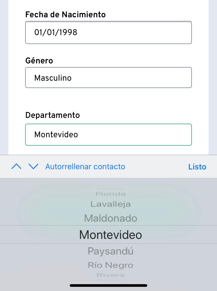
Another example of changes we implemented because of understanding our client was implementing native components in the forms, which are much more confortable for small and older phones, which they tend to have:

It's a fact: understanding users is essential to succeed. Agrotrabajo definitely wouldn't have had such great results if we had skipped the user investigation and analysis phase. So, if you're an entrepreneur, freelancer, developer or whatever, remember that this stage will help you make the most of your product.
Stay tuned or subscribe to our newsletter to receive Creating a Successful Product Part 2: Acquiring Users, about acquiring new users using SEO strategies, and part 3 about using data to provide a good user experience.

