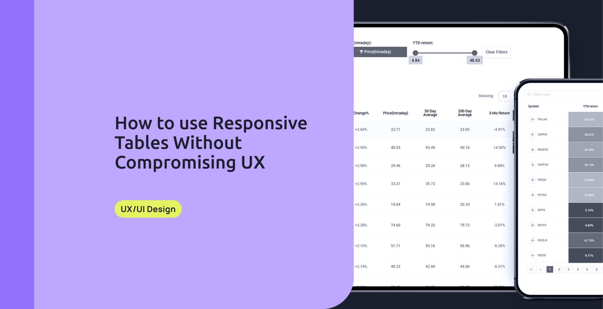
Tables are important tools that allow users to scan, analyze, and compare information. However, on narrow screens like mobile, they can become a real maelstrom for users. It's true that responsive tables aren't easy to create, and they compromise the users' experience. But don’t worry; this blog post will help you understand how to represent data in a better and more cohesive way on mobile devices.
Moveable tables are possibly the most common pattern on mobile tables, regardless of not being a fully responsible technique. Why? Simply because it's easy to use and definitely fast to implement. Movable tables require users to use swipe gestures to visualize the whole horizontal table. It’s not advisable in tables with large amounts of content as a large part of the content remains unseen.
If you want to go this way, there are a few features you can add to improve the overall experience:
- Maintain the primary column fixed so as not to lose context.
- Use color alternating rows.
- Avoid using many font styles and weights.
- Use sort & filter
- Make sure columns are resizable.
- Allow columns to be reordered
- Clearly indicate if a horizontal scroll is needed
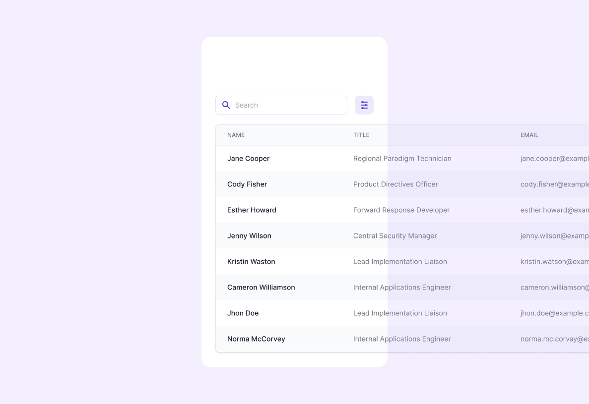
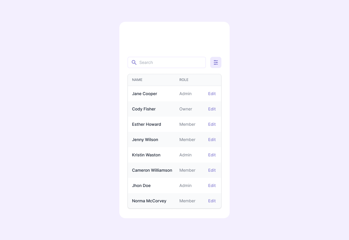
Another common pattern is shortening tables, it involves hiding the unnecessary columns and leaving on display only the crucial data. It can be applied to any data and various types of content. You should consider you'll have limited space and that you’ll have to resign to part of the data, which can be a bummer. Adding a 'view more' button can be a good practice in this case.
If you don’t want to leave any data unseen, my to-go solution when talking about responsive tables is transforming tables. This technique requires table rows to be collapsed into separate cards. It’s really useful for tables with huge amounts of data as it's a versatile way of displaying the information. Be aware that comparing particular data between rows can become a difficult task unless you take into account hierarchy. This means de-emphasizing secondary and tertiary information in order to highlight the most important elements.
Bear in mind:
- Font size won't control the hierarchy, try adjusting font-weight or color. Stick to 2 font weights (normal and heavier) and 3 colors (dark, gray, light gray).
- Don’t use light gray over colored cells.
- Use labels as a last resort unless they refer to technical specifications.

To round up, you must bear in mind your final user and the functionality of the table. The solution you choose depends on the data involved and how much you are willing to compromise.