

If you're in a meeting and the air conditioner is too low, you'll feel uncomfortable. You'll probably discuss with your colleagues "it's freezing here", "why's the air conditioner so high?" and you'll want to leave the room ASAP. However, if the air conditioner is just fine, you won't go around saying "oh, the air conditioner is at a perfect temperature" and feel thankful for it... you'll just take it for granted.
With UX Writing it's exactly the same. People don't go around saying "this webpage has great UX Writing", but when they're at an e-commerce feeling frustrated because of not knowing when to apply their promotional code, they'll probably abandon the site and blame it on the content.
This analogy made by Jared Spool helps us realize why it's so difficult for clients and software companies to understand the importance of good UX writing and the content-first approach.
Content-First Approach
Did you know that people only read 20% of the words on a screen during an average visit? This highlights the relevance of each word, it's structure and design.
The content-first approach underlines that content is key because it guides users throughout the experience. Often, content is thought as a final step after the design process, in which a copywriter "fills up" the blank spaces left by the designer. However, the content-first approach underlines the importance of developing the text throughout the design process to create user-first mentality sites and, in consequence, a good user experience.
UX Writers, Copywriters, Marketers...?
Copywriters and marketers tend to write from the product's or organization's perspective, showcasing those attributes they consider users should know. On the other hand, UX Writers are trained to think from a user's perspective. This means that, instead of prioritizing what the company wants the user to know, they prioritize the expectations of the user.
Let's take the example of a health insurance home site. It's probable that someone in marketing would showcase the company's newsletter, photos, sponsorships, activities, articles, etc. This seems good from a commercial perspective, however, it's not that great from a UX viewpoint.
A UX Writer would first investigate who are the main people entering the site and their purpose. For this, he will create user personas and their different scenarios. Perhaps he discovers that 30% of the traffic are members seeking for the insurance's phone number; 30% are potential clients interested on the plan offers; 30% are doctors accessing to their online schedule and only 10% of the traffic is actually interested on things showcased in the site's home.
This, of course, doesn't mean that marketing material isn't relevant. It means that, in digital products, the company's needs should be balanced with the user's needs to improve the outcome, and UX writers are trained to make this happen.
Tips for Good UX Writing
Be clear!
This is the number 1 tip from every UX Writer. Every word you use must be effective, meaningful, and useful. Avoid jargon, you won't sound smarter because of using academic and complex language... all you'll gain is people abandoning your site. Use plain language instead.
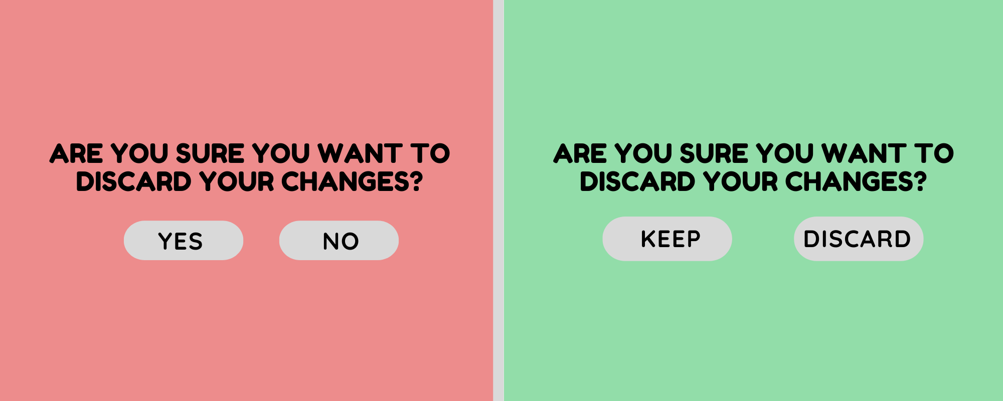
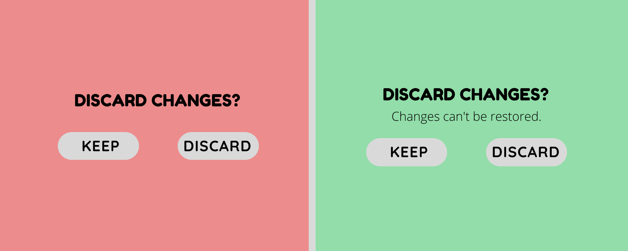
Be concise, brief, short, direct, straightforward, precise, succinct.
Have you read all the synonyms listed before? I'm sure you haven't. This is because your mind scans text and avoids redundancy and excess. Central tip: The shorter, the better.
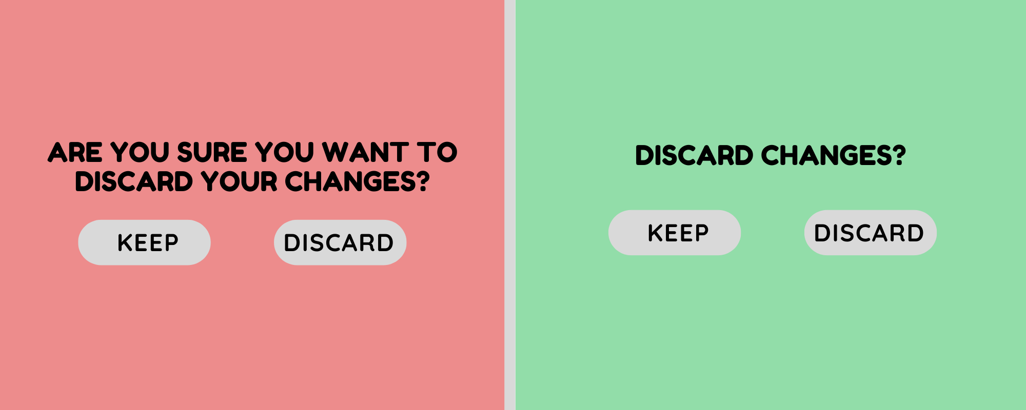
Concise BUT... don't lose the meaning
Sometimes, adding a few words can simplify and improve the user experience too.
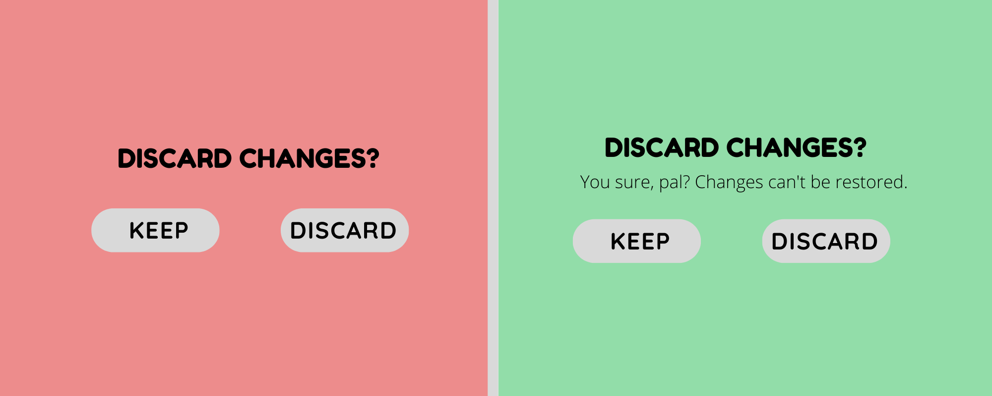
Brand Voice
Just as people, brands have personalities. The brand's voice is just as important as the brand's visual elements, so just as every brand has, for example, a color scheme and typography rules, brands should have voice rules too. Don't confuse voice and tone. The voice should be consistent, but the tone can be adapted to different scenarios. You may want to sound funny at the 'team' section, but you probably don't at the 'payment' check.
Chunking
Break up content into chunks for people to scan information more effectively. Use headlines, bullets and colors to transmit clear hierarchies and sections.
DON'T Save the Best for Last
Remember the old advice of "saving the best for last"? Forget about it. Taking into account the lack of attention and time people dedicate to reading sites, be straightforward when communicating the site's best attributes.
Timing is Everything
Get ahead users. What does the user want at this stage? What is he looking for? How can I indicate him how to find it? Creating User-Personas and their different Scenarios may help. Most importantly, test in real users to understand their mind when navigating. You want to solve this questions before they even ask them.
Consistency
Also be consistent with the terminology. If you're calling an action 'book a room' at one point of the interface, don't substitute it for 'reserve hotel' later. This may confuse users. The same applies for typography rules.
Data-Driven
Use data to justify your choices. If you're not sure about which terminology to use, check at Google Trends or Google Analytics which words people are using. If sales aren't taking place, use the Mix Panel Funnel to discover at which point of the flow people get stuck. Test, investigate and generate your own data to make the right calls.
Sound Human
This sometimes even means breaking grammar rules... sound's savage right? We break grammar rules all the time, so if we want interfaces to be user-friendly, they should too!
Always Double-Check
Even if the content is fine, always dedicate time and efforts to revising and exploring for new options that may be even better.