
The UX honeycomb is a diagram that explains the factors that have an impact on user experience. It was created by Peter Moreville, a pioneer of the fields of information architecture and UX. The UX Honeycomb is an iteration of a three-circle diagram Peter created with an information architecture mindset, that represents the balance between business goals and context, user needs and behavior, and content.
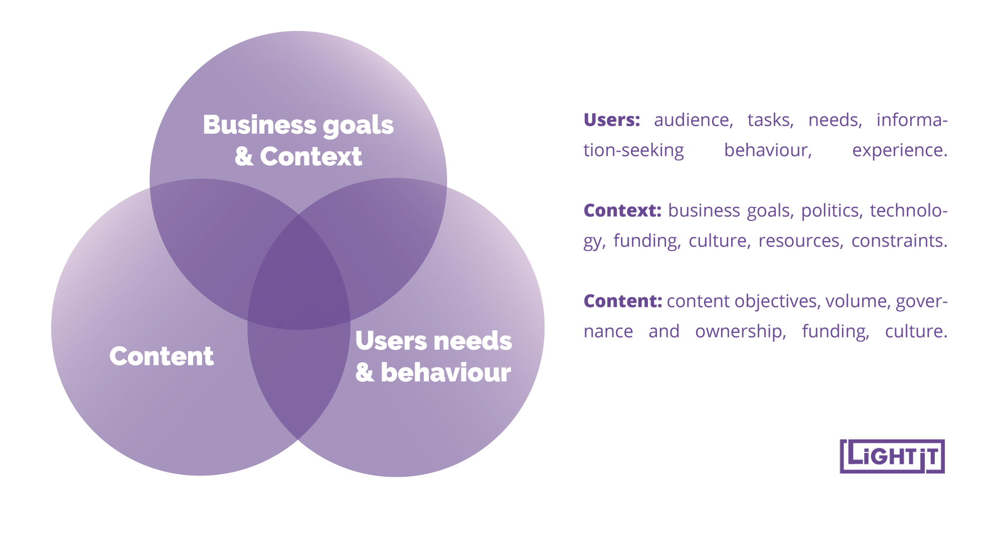
Peter found this diagram a good way of illustrating the different needs that must be satisfied by a product, and how creators should find a balance between all of them to achieve objectives. However, as he broadened his interests from IA to UX, he found the need for a new diagram that illustrated the facets of user experience.
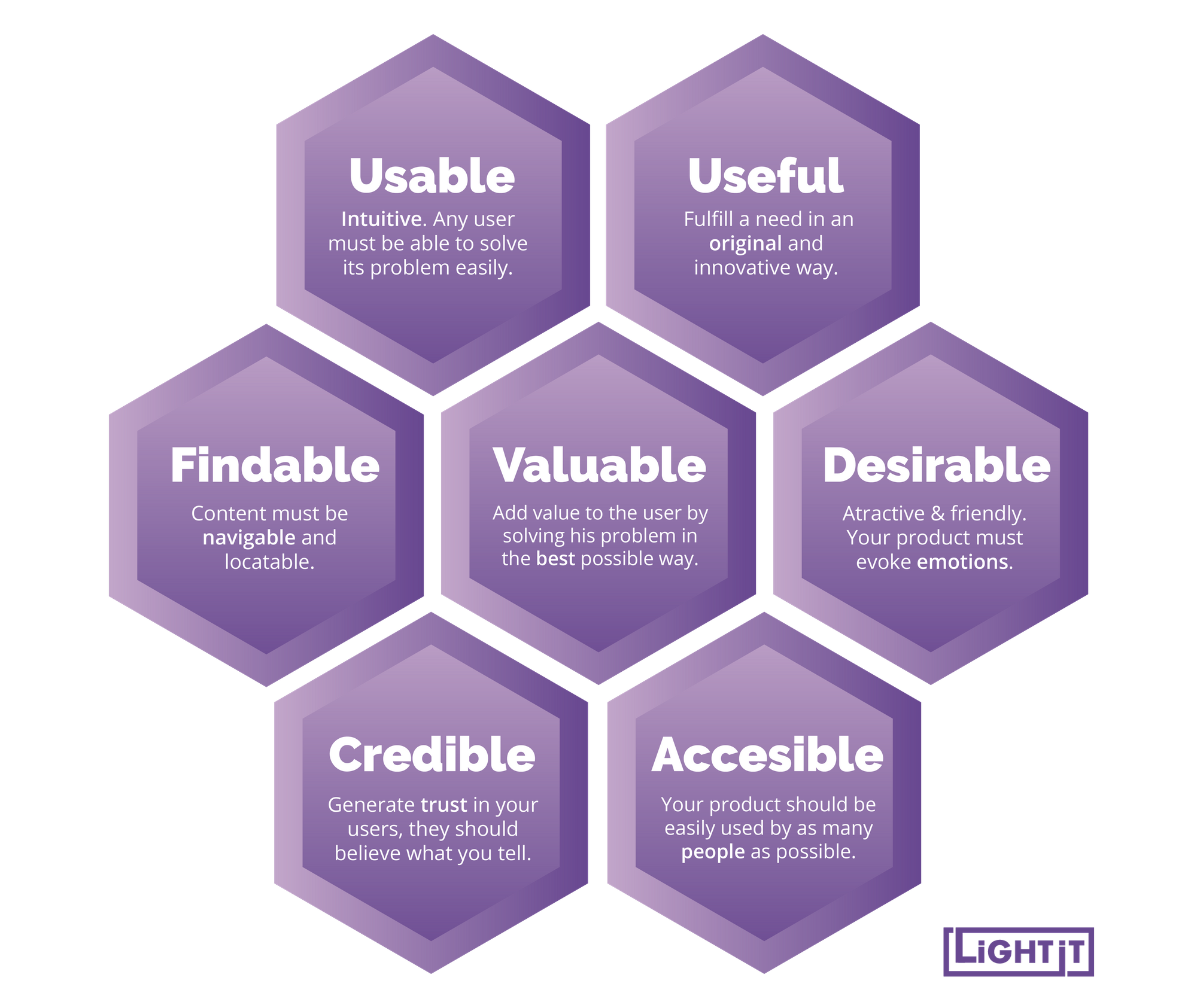
The UX Honeycomb is an amazing tool for designers to have on-hand when making decisions. It outlines all the key factors designers need to bear in mind while designing any digital product.
On the one hand, the UX Honeycomb is an excellent tool to help designers make up their minds when defining priorities. The truth is, in an ideal world, every decision and content must contribute to all of these factors. However, in the real world, this may not be possible. Sometimes it's necessary to prioritize one factor over others, and the UX Honeycomb will help designers bear in mind all the cards in play and consciously make their decisions. On what regards priorities, there isn't a recipe that works for everyone, priorities truly depend on the specifics of the project. However, I guess most UX experts may agree is that the key is to keep a balance to create a good UX.
The UX honeycomb is also a good summary of the different facets of UX and this may encourage designers to find their own paths and passions inside of the UX world. There are accessibility experts, usability experts, etc.
On the other hand, the UX Honeycomb is useful for helping clients understand why they must move beyond usability. It is a clear, concise, and visual way of communicating some really relevant information to hesitating clients that need encouragement to trust in the importance of balanced and good UX.
It's important to mention that some designers have worked over Peter's Honeycomb and optimized it, re-organizing the facets and even adding content.
All in all... Thank you Peter for summing up all of our objectives in a honeycomb :)