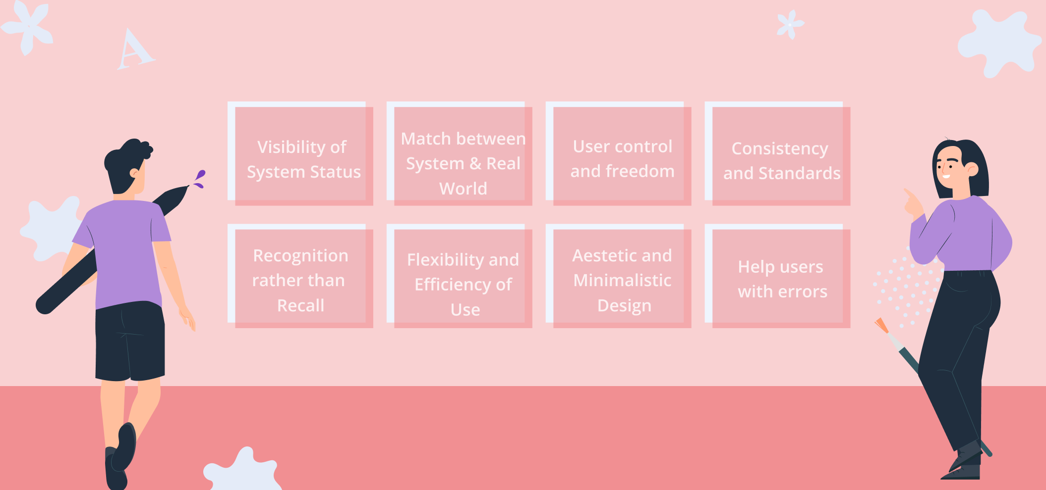
Technology is constantly advancing, and optimizing usability in apps, webs, and other software products is key to making the user's experience as smooth as possible. Take a look at ten Nielsen heuristics, and deep dive into this topic:
1. Visibility of System Status:
This refers to how well the system is delivering to its users. You must keep them informed and give them feedback at the correct time so they can easily understand what is happening. Remember, knowledge is power, and having open and continuous communication with your users empowers them to feel in control, make better decisions, and have a better experience in your system. In this digital world, visual elements are great tools to optimize communications and remember that being clear and predictable to your users will help you create trust in the short term. For example, when you click something in a web, you want to give feedback to your users and tell them that the system recognized their action successfully. For this, you may communicate it by changing the color of the button once clicked, showing a tick on the page, or any other simple indicator that users can understand. Another way to show the system status is by being persistent, meaning showing something all the time as the wifi status does at the top of your phone.
2. Match between System & Real World:
Try to avoid jargon or buzzwords while communicating to your users. People often think using them makes them sound professional and experienced, but it just complicates things, causes confusion, and makes it difficult for your users to connect with you. Users probably won't convert if they don't connect, so find your way to transmit your message as effectively, straightforwardly, and simply as possible. How? Make a deep market research and understand your target's language and its context, and adapt your system to it. What is the point of having the best product for your users if you cannot reach them and let them know it exists?
In addition, people seek similar experiences in the digital world to the physical world. They are looking for intuitive and automatic actions that make their experiences as effortless as possible in your system. This is called Skeuomorphic Web Design, and a clear example is the icons of the trash cans on the computer to eliminate things that mimic real-world objects. Another example is the Kindle, where you can digitally read a book and experience almost the same as if you have the physical world, as you can highlight things, make notes, pass to the next page, swipe, etc. The general objective here is always to minimize friction while using the system and make it as optimal as possible for your target.
It's crucial to remember that if you cannot do this, your users might get the idea that you don't really know them or don't care, so take your time to adapt your system for them and not for you.

3. User control and freedom:
Where there are people, there are mistakes, and no one wants to be tied to them for long. When clicking or typing something wrong, we seek fast ways to get out of it, go back, and start again with no extra consequences for the previous failed attempt. Imagine there is no way to undo actions; you'll need to be highly confident, cautious, and slow on every move you make on the web, and we know that's not ideal. Users become uncomfortable interacting online, and you'll end up with fewer people navigating freely on your site.
So, when users click something by mistake, they need a clear indication, button, or something that allows them to leave that unwanted situation quickly. Give them this sense of freedom: clicking on anything implies no negative consequence as it can be undone in seconds.
For example, in all browsers, the two arrows on the top left to take you back and forth between recent pages with just a click. Not having that would be so frustrating. Also, when completing a form, a good practice is to place "cancel" and "next" buttons, so users don't feel compromised when filling it up and allow faster interactions as they feel carefree about it. Thus, it's essential to have "undoing" and "redoing" options marked in your system.
4. Consistency and Standards:
Make your design predictable and learnable, and keep internal and external consistency. Nielsen stated that "people spend most of their time on sites other than yours," so if they are all consistent in some way, the user's experience is optimum and intuitive. For example, internal consistency can be used in your web or app by having the same color for all your CTAs. If this is blue, don't use the same blue for your banner blog post; it may confuse users, and they won't be sure which one to rely on to complete their wanted action. They'll probably drop off and go to the next page that better portrays the information. Then, external consistency is keeping this same approach but outside your product. For example, if users have expectations of how a feature should look or are used to a specific type of interaction, don't go against it; follow the trend, and you'll see how their experience with your product is much smoother. A classic feature is the shopping cart in the upper right corner of each web. Your eyes will naturally go there if you want to shop online, but if you don't have it placed there on your web, it might cause frustration and hence, fewer conversions.
5. Error prevention:
To have good usability in your design, you have to prevent the user from accidentally clicking a button that they were not supposed to or conducting an action that was not targeted. To prioritize having these error prevention designs, start with the actions that, when clicked, might cause severe damage or negative consequences, then the others that cause frustrations.
For example, these can be changing color, placing information in another order, or having a pop-up box or confirmation button before confirming any action. It is widespread, for example, in the financial apps or webs where they ask, "are you sure you want to complete this transaction" before purchasing. Even having a button to go back help communicate that any error the user makes on your web it's not permanent. Thus, users don't feel much pressure when clicking something and are motivated to navigate deeper into your web.
6. Recognition rather than Recall:
Let's start by stating the differences between recognition and recall.
Recognition: The context gives you more cues, and you recognize if the information provided is correct or not. Example: Do Uruguayans speak Spanish? This is straightforward.
Recall: The context gives you fewer cues, and you must recall and lean on your memory to think of the answer. This memory is based on your context, and the more cues we have about a subject, the easier it is to recall the information from our memory. Example: What language do Uruguayans speak? This one is more difficult and error-prone.
In the digital world, systems tend to give users extra help to recognize the best option for their specific objectives. The less friction, the less work, and the simpler your system deliver to the user, the better experience they will have. Thus, in your UI, always prioritize recognition over recall.
7. Flexibility and Efficiency of Use:
We all love shortcuts and macros. It makes our life easier. A simple accelerator as "command + "c" in our computers makes the user's experience much quicker and more comfortable than clicking the right button and selecting copy, right? Well, this is what the 7th heuristic is about. Having flexible processes with different ways of conducting the same action allows users to choose the one they prefer most to speed up their interactions and boost their efficiency. Still, it's crucial to bear in mind that both options (the quicker and the traditional choice) must be available. The accelerators tend to be used by more experienced users, and the new ones might feel overwhelmed so the'll prefer the traditional option. Another clear example is Instagram likes: you can click the heart below the publication or double tap the image to conduct the same action.
8. Aesthetic and Minimalist Design:
Keep the content and designs just focused on the essentials. To improve efficiency and help them complete their tasks, aim to have a high signal-to-noise ratio (relevant vs. not relevant), including all information that a user processes when interacting with your design. Having irrelevant information competing with the relevant one diminishes its visibility. Always prioritize content and features and remember, communicate and don't overload or decorate your web; it might cause the opposite effect you are looking for.
9. Help users with errors:
When a user makes an error, clearly indicate the problem. This may be with a visual sign or a message text, and remember to use simple language about the situation. Don't overcomplicate it, and make sure you show them next to it how to correct the mistake or undo it so they can continue seeking their targeted objective on your web. You should help them recognize the problem, diagnose it and recover from it easily.
10. Help and Documentation:
Users need help interacting with your applications or webs, no matter how well you think your design or how intuitive you make it. It should be personalized to your user's objectives and tasks and concrete and straightforward to be carried out.
For example, you can offer this help with pop-ups, FAQs, videos, tips, and chats, but it's important that the user feels comfortable and guided when using your application. A great way to know which of these are the best fit for you is using analytics tools, doing usability testing, and getting insights into where your users' frustrations are and what exactly they need to complete their objectives.