
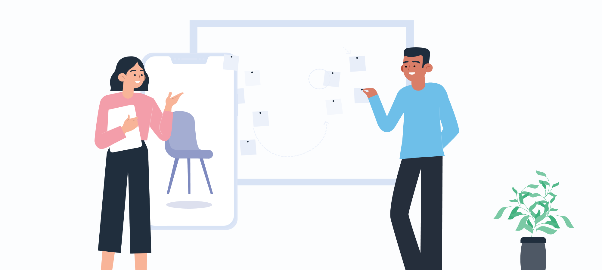
Envisionate is an AR e-commerce that allows users to scan rooms with their phone camera and get a 360º view of the site. Subsequently, they can virtually place furniture and other house items in the room to discover how they look and interact with the environment.
To design this product, we first had to figure out what competitors were on the market. We analyzed them deeply, taking into account their strengths and looking for ways to tackle their weaknesses to stand out from the crowd.
During this process, we decided to dive deeper into Ikea Place's user experience. Why? Firstly, because it was developed by Ikea, who we knew had the budget and workforce to create a superior product. Secondly, users love it! Ikea place is the most popular free non-gaming app with a review of 4.6/5.
In the following section, we will analyze Ikea Place, pointing out where we chose to take different paths and why we did so.
Main challenges:
Scanning process
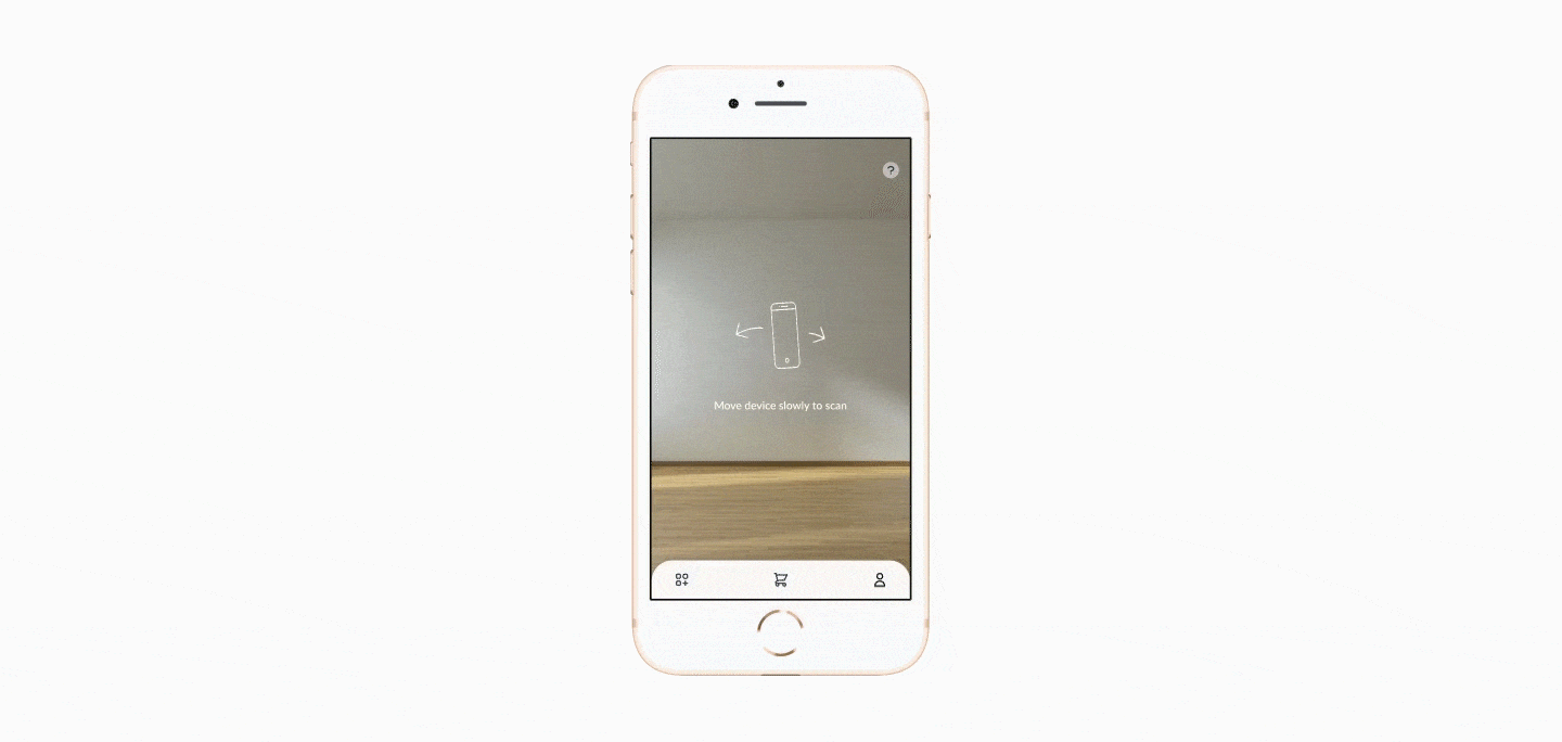
Using AR is highly complex, and the scanning might take longer in environments where light conditions aren't optimal. When using Ikea's app, entire minutes could go by without the user receiving feedback about what the problem is or being able to ask for help. This leaves them frustrated, and they might close the app because "it doesn't work."
To avoid this, we designed a loading screen that informs the user that scanning is still in progress and included a help button accessible at any time, where the user can see FAQs that can help them understand what the issue might be.
Item placing
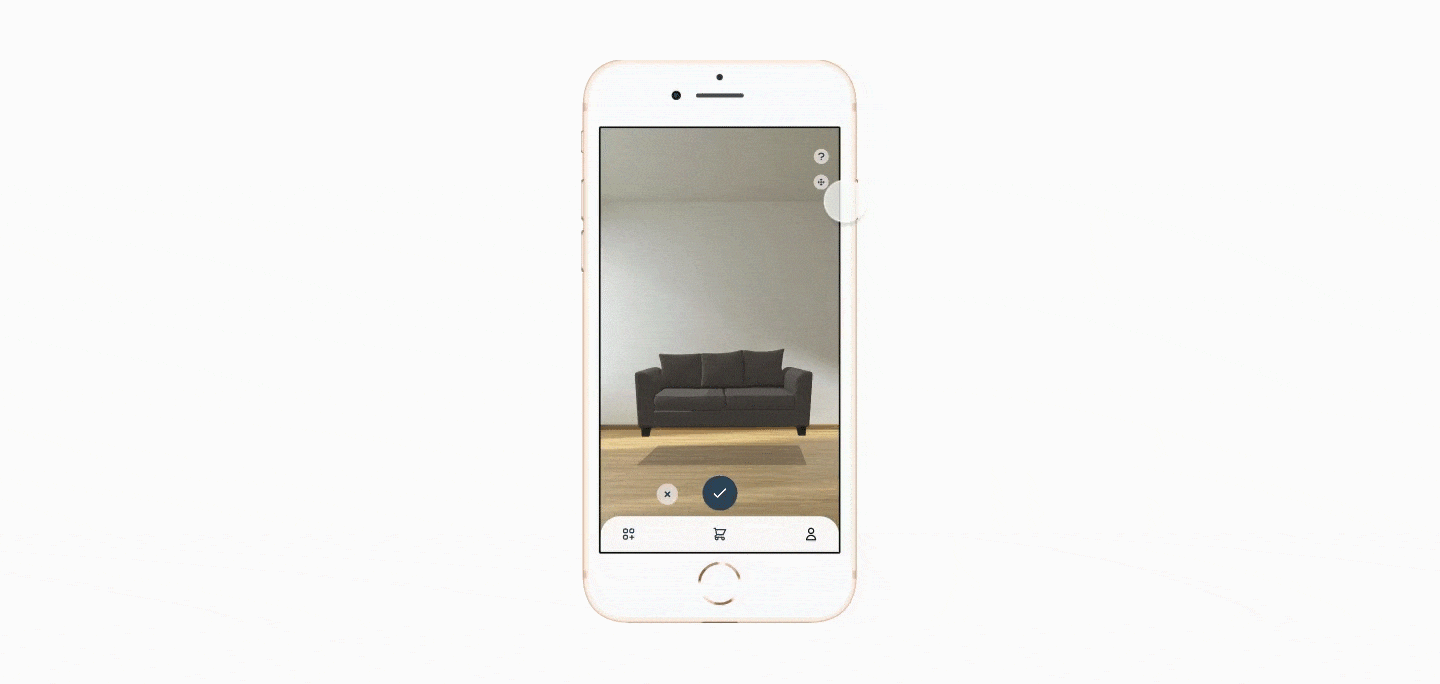
To adjust an item's placing, Ikea Place responds to user gestures like pinching or dragging. It can sometimes make users struggle to get the product where they want to, considering they might be using the app on a cell phone or have bigger fingers.
Taking this into account, we decided that users would move items by pressing arrow buttons placed on the screen. These allow the user to rotate and move the object on both axes. When the user does not need this feature anymore, they can collapse it and reopen it by tapping on the "moving button."
Catalog

When designing, we also have to take into account the market we are doing it for, considering that different brands will have different user types and business models.
Because of Ikea's size and its over 10000 products to offer, we understood it made sense to have such an extensive catalog with both horizontal and vertical scroll, different collections, and even a search bar.
In our case, since we were just dealing with fewer products, we believed the process of choosing an item should be more straightforward. That is why our catalog directly shows them the products and allows the user to swap between different categories, making this process easier and faster.
Simplifying buying flow

Since we designed a marketplace app, we decided that the user flow to buy a product should be short and efficient. That is why, as soon as the item is placed on the scene, it will also be automatically added to the user's shopping cart.
Prioritizing
We have a LEAN and Agile mindset, so we focused on creating an MVP that included the core functionalities. Once the product is validated on the market, we will definitely add new ones, like social sharing or saving an item as a favorite. We follow this approach as it helps us make more confident decisions, leaning on real user feedback and insights; plus, it optimizes time and costs.
Conclusion
The design of this app helped us remember some valuable lessons. Firstly, the importance of considering edge cases, especially when working with AR technologies where users tend not to be used to how it works. Also, the importance of understanding the context of the businesses we are designing for, where they see the most value, and what to prioritize in our deliverables. Plus, it was a fantastic project to work on and learn more about AR!